Logo Usage
The Logo

When to use the Logo
The College logo should be used on all media directed at external audiences: prospective students, their parents, or the general public.
- postcards
- viewbooks
- brochures
- t-shirts
- bumper stickers
- billboards
- websites
- social media posts
- College letterhead
- business cards
The Icon
When to use the Icon
The icon is primarily used for internal audience situations (current students, alumni, employees).
Otherwise, it may be used in situations where the College identity is obvious in context or explained elsewhere in the surrounding text.
The Crest

When to use the Crest
The full color crest is only ever used for letterhead, official College documents, and formal ceremonies. It is the official seal of the institution. In every other usage, the allowable colors are white and black. There is a gilded crest, but it is only ever used for the College President.
- The typeface is Minion Pro semibold.
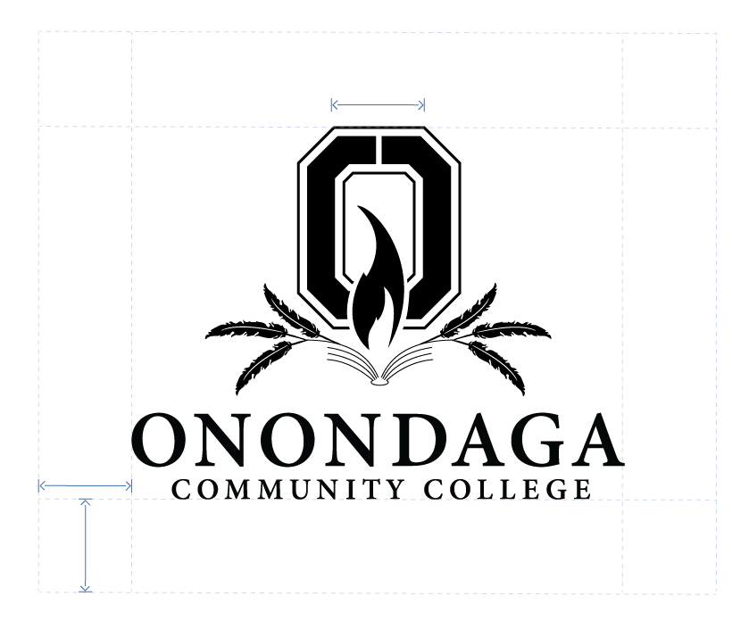
- Whitespace should be what is shown here.
Allowable Usage
Whitespace
The logo needs some room to breathe. Please provide one "O" worth of empty space around the logo to distance it from neighboring text or the outer edges of your physical object.

Contrast
The logo needs to stand out. Please ensure adequate visual contrast between the logo and its background. For examples of alternate color combinations, please refer to the College Color Palette.

Cropping
Only the icon may be cropped. Please ensure that the inner "O" is always fully visible.

Watermark
It is OK to use the icon as a watermark in creative graphic design. In these cases, you can decrease the visual contrast for a more subtle effect.

Prohibited Usage
Replacing O's in words
Please don't replace o's in words with the icon. The only situation where this is permitted is in the College Logo.

Stretching / Squashing
Please maintain the logo's natural proportions.

Rotation
Please don't rotate the logo or icon.

Altering the Font
Please don't attempt to recreate, replace, or modify the font used in the logo.

Altering the Colors
Please don't change the colors of the logos provided or add gradient effects.

Adding a Dropshadow
Please don't add a dropshadow to the logo. It should be given a high contrast background instead.

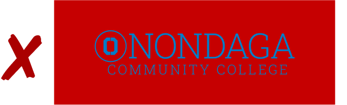
Not Enough Contrast
Be sure to provide enough visual contrast between the logo and its background.

Noisy Backgrounds
If the background is too noisy, it's best to give the logo a solid color box so that it has adequate separation from the background.

Bad Color Combinations
Avoid using garish or complementary color combinations with the logo.